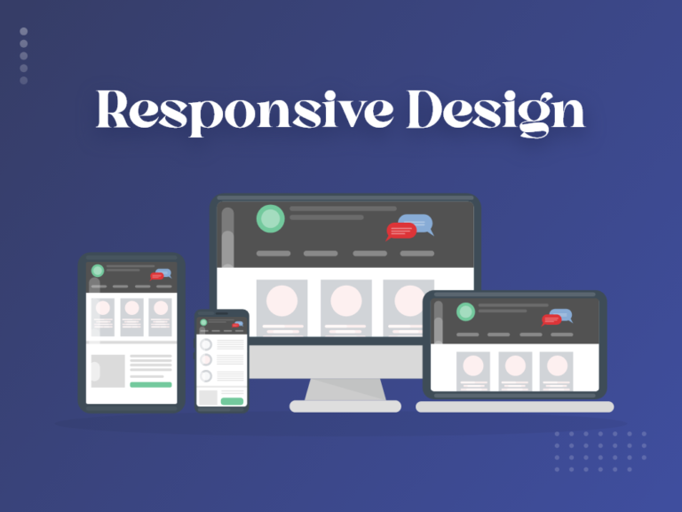
Responsive design in web development refers to the approach of designing and building websites that can adapt and respond to different screen sizes, devices, and orientations. With the wide variety of devices used to access the internet, such as smartphones, tablets, laptops, and desktop computers, it’s essential to ensure that websites are accessible and visually appealing across all platforms.
Responsive design involves creating a flexible layout and using fluid grids, proportion-based grids, and flexible images and media queries. These techniques allow the website’s content and design elements to automatically adjust and reflow based on the screen size and resolution of the device being used.
Key Elements of Responsive Design
A responsive web design must incorporate the following essential features.
Mobile-First Approach
With a mobile-first approach, developers design and build the website starting from the mobile version and then progressively enhancing it for larger screens. This ensures a smooth and optimized experience on smaller devices, with additional features and layout adjustments for larger screens.
Media queries
Media queries are an exciting aspect of responsive web design, although they can be intimidating for designers who are unfamiliar with them. It’s important to recognize that media queries alone are insufficient for a responsive design. A solid foundation in HTML and CSS, including a flexible grid and images, is crucial. With media queries, designers can create multiple layouts using the same HTML documents. This is achieved by selectively applying stylesheets based on the features of the user’s device, such as browser window size, orientation (landscape or portrait), screen resolution, color capabilities, and more.
media queries and responsive design empower us to break free from the limitations of specific screen sizes or resolutions. They enable us to build websites that can adapt flexibly to a wide range of mediums.
Flexible image
Flexible images play a significant role in responsive web design but can often be a source of frustration for web designers. Images and media elements are resized and scaled proportionally to fit different screen sizes without distortion or loss of quality. This is achieved by setting max-width: 100% on images and using media queries to adjust sizes. It’s important to address the challenges associated with flexible images.
One common issue is loading large, oversized images and then scaling them down using HTML attributes like width and height. This practice can negatively impact web page load times, especially if the website contains numerous images. As web design evolves, we’re witnessing a trend of incorporating fewer unnecessary images and stock photos.
Fluid Grids
When it comes to web design, the concept of a flexible grid can be ambiguous. It doesn’t necessarily mean you have to choose from existing grid systems available in the market. Defining your parameters for columns, spacing, and containers can often be the best approach, offering the same level of flexibility as any established system. Instead of using fixed pixel-based measurements for layout, the responsive design employs relative units like percentages or ems. This allows the layout to adapt and scale proportionally to the screen size.
Many pre-existing grid systems use CSS classes to determine size, spacing, and alignment, which can pose challenges when integrating them into a responsive web design. It may require more effort and time compared to coding your grid. Whether you opt for a pre-made grid system or a custom solution, the crucial aspect of a flexible grid lies in how you structure your layout sizes and spacing.
How does Responsive Design Work?
Responsive web design is achieved by leveraging Cascading Style Sheets (CSS) and implementing specific settings that adapt the style properties based on the user’s device characteristics. CSS offers several features that support responsive design, including viewport and media queries. These properties enable the website to adjust its layout, content, and appearance to fit different screen sizes, orientations, resolutions, and color capabilities.
Tips for Responsive Design
Once you have a good understanding of responsive design, here is a concise guide to help you make the necessary changes to your website:
Embrace a fluid grid
Instead of using fixed pixel measurements, employ a fluid grid that sizes elements proportionally based on the screen size. This ensures that elements respond to the screen’s dimensions rather than being set in pixels. Modify your website’s CSS and code to establish rules for the grid.
Cater to touchscreens
Consider both mouse and touchscreen users when designing your responsive website. Optimize forms and interactive elements for touch input, making them more prominent and easier to press on touchscreen devices. Ensure that images, buttons, and calls to action display well on all screens.
Customize elements for small screens
Tailor your website’s appearance for small screens by condensing menus and navigational options into expandable buttons. This allows for a streamlined user experience on smaller devices. Use CSS and code modifications to define rules for including or excluding specific elements.
Address image sizing
Image sizing can be a challenge in responsive web design. Establish rules in your CSS to handle images on different screens, such as making them full-width, adjusting their display, or employing alternative handling methods.
Consider pre-designed themes
If you’re not a designer or lack the time to create a responsive website from scratch, consider using pre-designed themes or layouts. Many themes for platforms like WordPress or e-commerce providers come with built-in responsiveness. You can simply customize the colors, branding, and content to align with your company’s needs.
Outsource the project
If you can’t find a suitable pre-designed theme or desire a custom design, consider hiring a professional web design company or freelancer with expertise in responsive design. Verify their references and allocate a budget for a thorough job that aligns with your specific requirements.
By following these steps, you can successfully transform your website into a responsive one, enhancing the user experience across various devices without compromising on design or functionality.
Strengths of Responsive Design
Responsive design in web development offers several advantages:
Enhanced User Experience
Responsive design makes sure that your website adapts to different screen sizes and devices. This provides a seamless and consistent user experience, regardless of whether visitors are accessing your site on a desktop computer, laptop, tablet, or smartphone. It eliminates the need for users to zoom in or scroll horizontally, making it easier for them to navigate and consume your content.
Increased Mobile Traffic
With the growing popularity of mobile devices, having a responsive website is crucial to cater to mobile users. Responsive design allows your site to be easily accessible and visually appealing on smartphones and tablets, leading to increased mobile traffic and engagement.
Improved SEO Performance
Responsive design offers the advantage of improved search engine rankings for mobile devices. Mobile-friendly websites receive priority in search engine results, especially on platforms like Google. By implementing a responsive design, your website has a higher chance of ranking well in mobile search results. This increased visibility can lead to a significant boost in organic traffic to your site.
Cost and Time Efficiency
Creating a separate mobile version of your website can be time-consuming and costly to develop and maintain. With responsive design, you can have a single website that automatically adjusts to different devices, reducing development and maintenance efforts. It eliminates the need for managing multiple versions of your site and ensures consistent updates and improvements across all devices.
Better Conversion Rates
A positive user experience plays a crucial role in converting visitors into customers. Responsive design provides a seamless browsing experience, eliminating barriers to engagement and increasing the likelihood of conversions, such as form submissions, purchases, or sign-ups.
Easier Website Management
With a responsive design, you can streamline your website management and content updates. Instead of maintaining separate desktop and mobile versions, you only need to make changes once, and they will be reflected across all devices. This simplifies the management process and ensures consistency in your content and branding.
Overall, responsive design offers numerous benefits in terms of user experience, mobile traffic, SEO performance, cost efficiency, conversion rates, and website management. It enables you to reach a wider audience, optimize your online presence, and achieve your business goals effectively.
Weaknesses of Responsive Design
While responsive design in web development brings many advantages, it’s important to consider potential disadvantages as well
Complex Development
Implementing responsive design can be more complex and time-consuming compared to creating a fixed-width website. It requires careful planning, designing, and coding to ensure proper layout and functionality across different screen sizes and devices.
Increased Development Time
Developing a responsive website typically takes longer than building a non-responsive site. Designing and testing for various screen sizes and devices require additional effort, which can extend the overall development timeline.
Potential Performance Issues
Responsive websites may face performance challenges, particularly when dealing with large images or complex layouts. Optimizing the site’s performance across different devices and screen sizes requires additional considerations and testing to ensure fast loading times and a smooth user experience.
Content Limitations
Displaying content uniformly across different screen sizes can be challenging. In some cases, you may need to prioritize certain content or make adjustments to accommodate smaller screens, potentially leading to a more condensed or simplified presentation. This could result in limitations on the amount of information displayed or potential design compromises.
Compatibility Issues
While responsive design aims to provide a consistent experience across devices, certain older browsers or devices may not fully support responsive techniques. Ensuring compatibility and proper functionality across a wide range of platforms and browsers can be challenging and may require additional development and testing efforts.
Increased Complexity for Maintenance
Maintenance and updates can become more complex with a responsive website, especially when modifications need to be applied to ensure consistent functionality across different devices. Changes made to one part of the site may require adjustments in multiple places to maintain responsiveness, potentially increasing the complexity of ongoing website maintenance.
It’s essential to weigh these potential disadvantages against the benefits and consider your specific project requirements, resources, and target audience when deciding whether to adopt responsive design in web development.
Importance of Responsive Design
Responsive design is not a fad but a crucial long-term strategy that requires your investment. As screens continue to evolve, your website must cater to all browsers, regardless of the device they use.
Just as you warmly greet customers in your shop, offering them a beverage and assistance, you aim to provide an equally pleasant experience online. A user-friendly and enjoyable website encourages visitors to stay, explore, make purchases, and even return in the future. Consider your own online experiences. Would you revisit a website that takes ages to load, displays poorly on mobile devices, or simply doesn’t function correctly? Certainly not! This is precisely why it’s crucial to ensure that your web design operates seamlessly on all devices, and responsive design holds the key to achieving this.
By implementing a responsive design, you can eliminate concerns about new technologies rendering your website outdated. Your site will be equipped to adapt to any advancements, ensuring peace of mind and cost-effectiveness while keeping your visitors satisfied.